Who I Am
Staff Product Designer with 10+ years in enterprise B2B, B2C and SaaS (Nintex, FPT Software, WhipMobility). My work spans Product Design, multi-theme design system architecture, and team leadership, plus mentoring designers through ADPList.
Best on a bigger screen
The case studies are full of detailed boards, journeys and live prototypes that need room to breathe. Open this page on a wider screen to explore them properly.
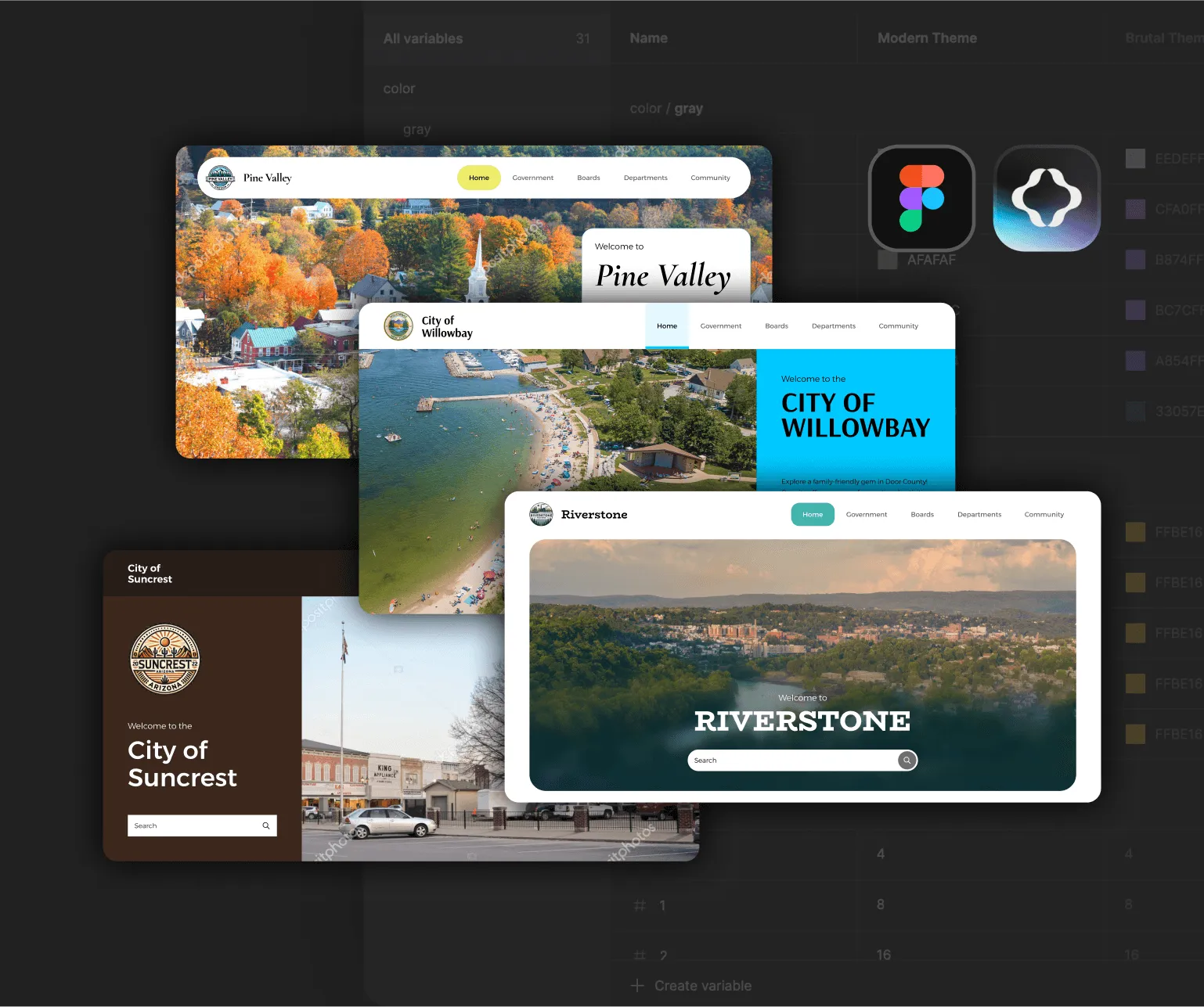
Staff Product Designer with 10+ years shaping complex products, backed by deep design-systems expertise, hands-on front-end skills, and leadership across international teams.

Staff Product Designer with 10+ years in enterprise B2B, B2C and SaaS (Nintex, FPT Software, WhipMobility). My work spans Product Design, multi-theme design system architecture, and team leadership, plus mentoring designers through ADPList.
I lead enterprise UX product design and design systems, using AI agentic design and workflow automation to close the design-to-dev gap. Results: 40% faster delivery at FPT Software, 25% higher retention at WhipMobility, and 50%+ dev-effort savings across 8+ teams.
I’m relocating to Europe — open to visa sponsorship — to join a product design team and work on design systems while mentoring the next generation. I’m most energized by scaling design thinking, building inclusive team culture, and shipping products that matter.
lists the locations of the clients I have worked with, it showcases my adaptability in working with clients across different geographies and cultural environments
lists the industries of the companies I have worked for, showcasing my versatility and adaptability in working across different business sectors.
Fluent English and native Arabic — comfortable working with distributed, multilingual teams.
list of companies I have been working with them
10 years shipping enterprise products (Nintex, FPT, Petronas, WhipMobility) across Europe, Asia, and the Middle East. Understand workflows, stakeholder alignment, time-to-market pressure.
I write HTML, CSS, JavaScript. Bridge gaps between design and engineering. Reduced handoff cycle time by 40%.
Mentors designers, known for simplifying complex concepts and staying calm and professional, even in tough situations. Built team processes and critique rituals that stick, leaving mentees inspired and empowered.
Agentic Design Systems, multi-theme & multi-brand systems. Proven adoption across 8+ teams. 50% reduction in design-to-dev effort.
Design governance, AI-assisted prototyping, user research, accessibility (WCAG), and multi-theme and adaptive theming systems.
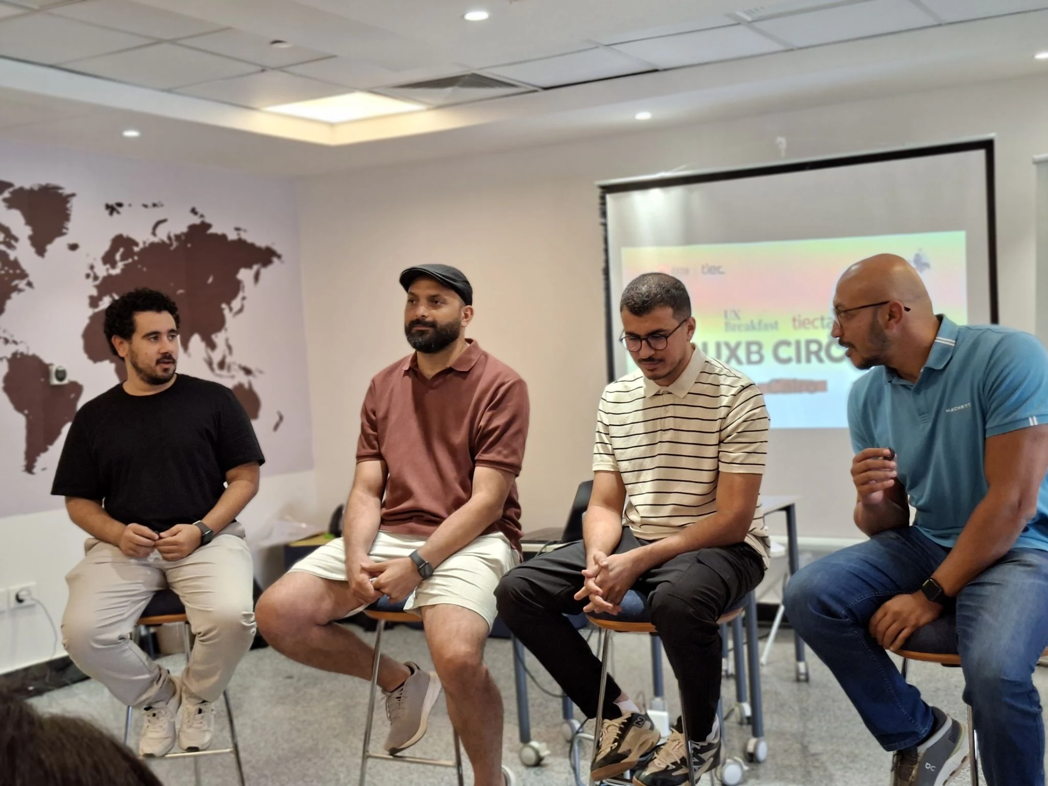
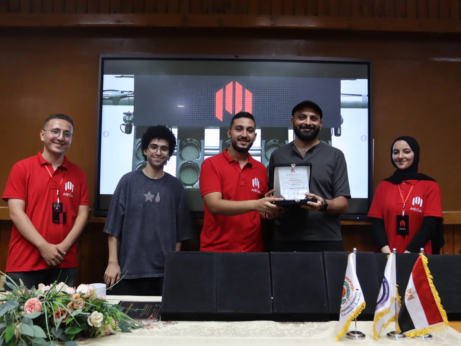
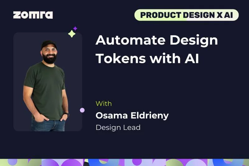
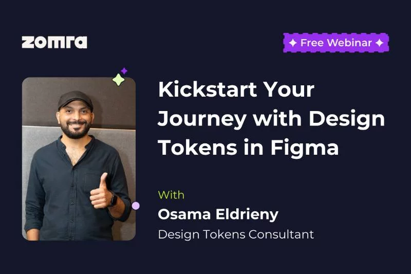
I’m active in the design community, mentoring 300+ designers, hosting hands-on workshops across the region, sharing what I know through my YouTube channel and articles on Medium, and building free tools for other designers.



UX Designer
Osama is one of the best leads I've worked with. He designs with passion, teaches his team to improve, and shares the latest in tech and design. He combines deep UX knowledge with a great sense of humor, effectively leading and guiding his team.

UX Lead
Osama is a true professional, always up-to-date with the latest in design and development. He generously shares his knowledge, ensuring everyone benefits. Personally, he radiates positive energy and inspires with his passion for design. I admire and respect his dedication and look forward to learning from him every day.

Senior Product designer
Osama is an exceptional UX mentor with deep expertise and professionalism His ability to simplify complex concepts & provide practical guidance made learning UX both accessible and enjoyable, helping me build valuable skills and confidence

Senior UX Designer
Osama is an exceptional designer and leader, consistently going the extra mile. His generosity in sharing knowledge and simplifying design tokens is truly inspiring. He has helped many, including myself, and his passion and friendly nature make working with him a joy

CX Designer
Working with Osama as my UX mentor was a pleasure. His deep knowledge and detailed guidance provided valuable insights and improvement areas I hadn’t considered. Thanks, Osama, for your expert support.

UX Lead, Content Creator
Osama is one of the best people who explain things from whom you can learn. He provides unique and well-crafted content

UX Lead
Osama love helping People, Very good educator, Well known in the community, One of the best in using Figma

UI/UX Designer
really good mentor that is willing to spend the time to explain on best practices. While Osama seems to be really passionate in UI and design system, he is also really experienced in UX and collaborating effectively with project/product team even in stressful circumstances. He is someone that I can learn a lot from and look up to!

UI/UX designer
Eng Osama is a very high experiences and knowledge,I learnt a lot from him , he led me to correct mistakes I faced and what i need.

Product Designer
I had a great mentorship session with Osama. His deep understanding of my challenges and tailored advice made his guidance exceptionally effective, greatly aiding my career progress.

UI Designer
Osama mentors & leads with skill, his advice greatly improved my project His advanced prototype impressed even our design lead. He is a supportive leader and mentor, always offering guidance, especially in tough times. He is truly an asset to any team

Design Lead
Osama is one of the best team players I have worked with. He possesses exceptional communication, cooperation, and leadership skills

Product Designer
Osama's well-thought-out design process and collaborative approach are remarkable. His willingness to share his insights makes him one of the top designers I've encountered

UI Designer
Describing Osama as a UI/UX professional is simple: '.' He is a phenomenal designer who loves his work and giving back to the community He teaches peers and coworkers with a genuine desire for mutual growth, excelling as both a professional and mentor.

UI/UX Designer
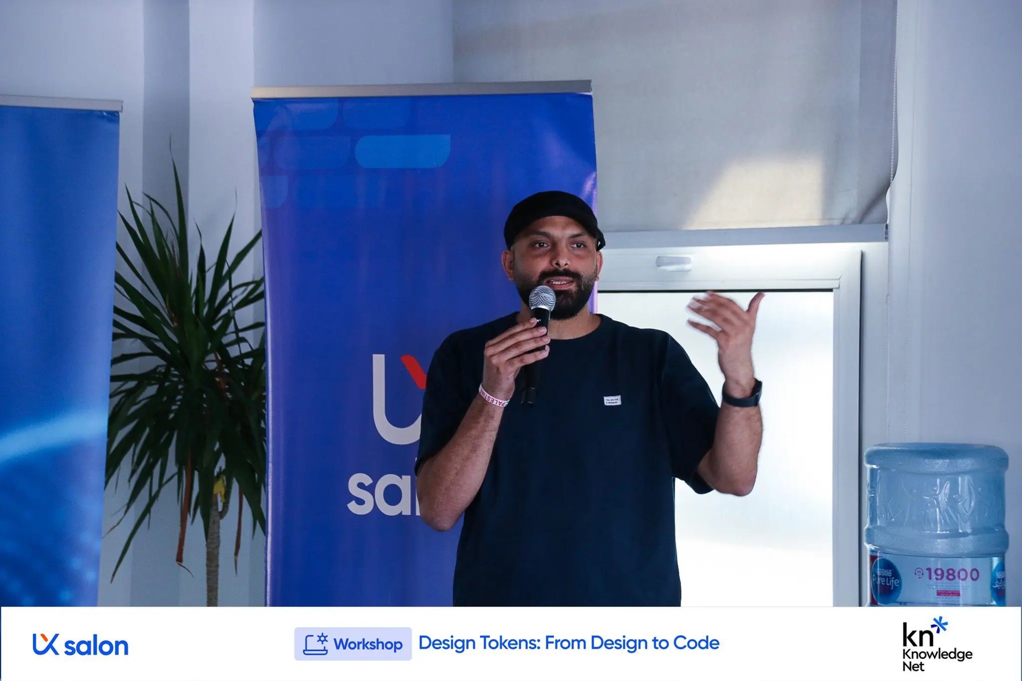
Attending 'Design Tokens: From Design to Code' was a great opportunity. I learned to hand off designs pixel-perfect and apply new techniques that will save time in future iterations. Thanks to Osama Eldrieny for this invaluable session!

UX Lead
Oo is like a walking Figma guidebook, always generous in helping designers develop their skills. His deep understanding of Figma and UX ensures our projects follow proper methodologies. He frequently organizes workshops and is ever ready to assist, earning praise from our manager for his excellent implementation of UX processes

iOS Engineer Lead
Osama is super professional in UI/UX and he have very good understanding of them. He is very kind and most important thing is he hear you carefully while you talking with him. He just need more space for bring his creativity

UI UX Designer
Osama's expertise in UI/UX was invaluable. He answered my questions with clear explanations and patience providing encouragement that kept me motivated and helped me overcome challenges

Design Lead
Osama has been an inspiring designer and role model making a significant impact on those around him. His contributions to the UX community are remarkable, and I'm grateful for the friendship and guidance he's provided. Proud of his journey and thankful for the positive influence he's been.

Product designer
Osama Eldrieny’s free courses provide specialized, step-by-step guidance comparable to paid ones. They come with ongoing support, continuous development, and regular updates, ensuring a comprehensive learning experience.

UI/UX Designer
helped me develop myself and take some steps that will make a huge difference in my track

Design Lead
Osama is always helpful and willing to teach. He stays calm and professional, even in tough situations, and his sense of humor keeps everyone smiling. He has made valuable contributions to the Innovation and Design team on key projects

UX / UI Designer
I had the pleasure to take the advice from an expert user experience design like Osama, and definitely recommend dealing with him, friendly and extremely cooperative person

Product designer
I recently had a mentorship session with Osama, a skilled UI/UX designer. His guidance was invaluable, helping me navigate UX/UI design and leaving me inspired and empowered

UI/UX Designer
Eng Osama is a patient person with great experience and insight. I really benefited a lot and know what I'am missing. He directed me to learning sources and it was an informative lecture

Android Engineer
Osama does anything related to UI/UX so wonderfully. The way he is providing us with a pre-design in Pl/sprint planning is so useful to understand what exactly we need to do in our sprint
Tools I built to speed up design-token and feedback workflows — no technical experience required.
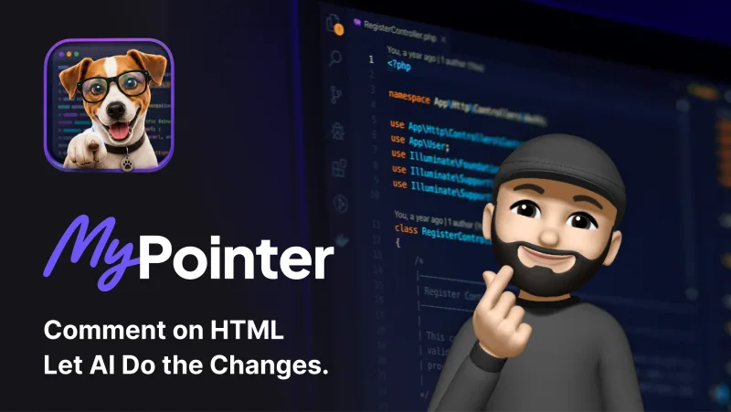
Element-level feedback for AI teams — click, comment once, and let Claude apply the change instantly.
Open tool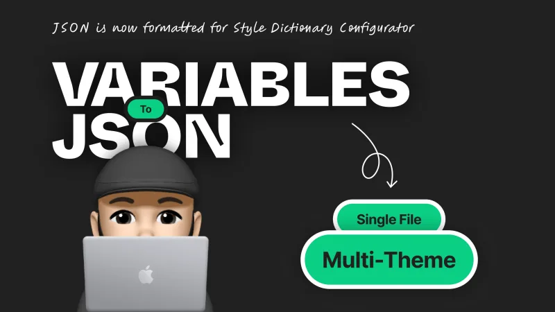
Convert Figma variables into structured JSON — ready for Style Dictionary Configurator and Multi-Theme Generator.
Open tool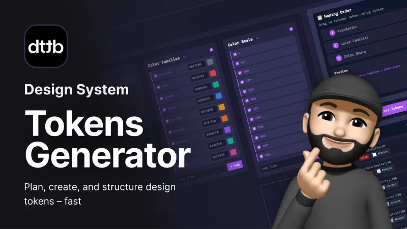
Plan, name, and export primitive, semantic, or component tokens — ready for Figma and multi-tool workflows.
Open tool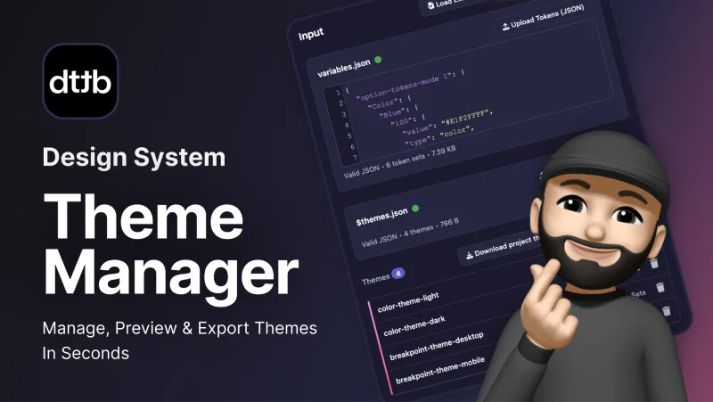
Create, edit, or import design token themes and export them across platforms — no coding required.
Open toolThoughts on design systems, productivity, and the design career — published on Medium.
Case study 01
Token Architecture · Multi-Theme Design System
A deep-dive into how I defined the token architecture: three tiers of tokens, a shared naming system, and independent theme layers, so brands and modes never leak into each other. I then connected it to code with a Figma-to-code pipeline: a design decision change now needs zero developer effort, and adding a new brand or theme in code takes about an hour instead of days.




Section 01
Design and code named the same decisions differently, and every brand and mode was wired to the same values, so each new theme meant manual rework instead of a simple switch.
This case study focuses on Architecture and Naming. Feel free to ask me later about Pipeline and Workflow.
01 · Problem
Naming is where communication between design and dev breaks down: two teams name the same five decisions, with nothing in common.
01 · Problem
Get the architecture wrong and the structure can't scale: brands and modes lose their independence from each other, tokens become inflexible, and every design decision means manual rework for developers.
01 · Problem
02 · Challenges
Add unlimited themes without ever touching components?
Let designers change decisions without creating manual work for developers?
Make Figma tokens and code speak the same language?
Automate the path from Figma variables to production code?
02 · Challenges
02 · Challenges
Structure 1
Structure 2
Structure 3
Structure 4
03 · Solutions explored
Each structure fixed more of the problems than the one before, and only Structure 4 fixed them all
| Checklist item | Structure 1 | Structure 2 | Structure 3 | Structure 4 |
|---|---|---|---|---|
| Works in Figma | Yes | Yes | Yes | Yes |
| Flexibility to change components independently | No | Yes | Yes | Yes |
| Independent modes (light and dark change on their own) | Needs confirmation | Needs confirmation | Needs confirmation | Yes |
| Independent brands (one brand's values never affect another) | Needs confirmation | Needs confirmation | No | Yes |
| Themes expand without Figma limitations | No | No | Yes | Yes |
| Converts cleanly from Figma → JSON → CSS, no manual fixes | No | No | Yes | Yes |
| No code changes needed for design updates | No | No | Yes | Yes |
03 · Solutions explored
Semantic naming stopped changes from spreading to other components and modes.
Splitting every token level into its own collection let themes expand past Figma's limits and convert to code automatically.
Making every token level brand-aware finally gave each brand its own independent values.
04 · Final solution
Every brand, mode and dimension is fully independent
Safe design iteration: designers change decisions without breaking code
Full automation from Figma to code
New themes can be added without hitting Figma's limits or needing manual fixes
04 · Final solution
Each theme is independent and controls its own properties
| Theme | Modes | Controls |
|---|---|---|
| Brand | Diamond, Amber, Opal | Colors (with Color theme) |
| Color | Light, Dark | Colors (with Brand theme) |
| Language | English, Arabic | Direction, text content, left/right border width, plus typography (with Typography theme) |
| Typography | Serif, Sans-Serif | Font family, size, weight, line height (with Language theme) |
| Density | Comfortable, Compact | Padding, margin, gap |
| Radius | Square, Round, Pills | Border radius |
| Shadow | Flat, Subtle, Default, Raised | Shadow X, Y, blur |
04 · Final solution · The output
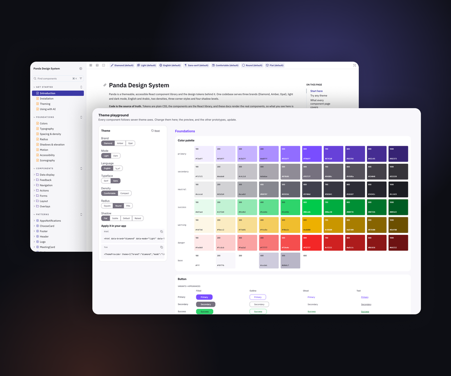
A live preview of a few components in the browser, as phase 2 of the pilot test.
Open the demo04 · Final solution · The output
A Storybook-style guide to every component, its variants and guidelines, with copy-ready code and a source of truth for AI.
Open the documentation04 · Final solution · The output
A dashboard built from the component library, switch between any theme combination.
Open the prototypeSection 05
Proving the system early, on one very small component
From one component to many
Validated in both design and code
Section 06
Measurable outcomes
From days to hours, with an 82% average improvement
| Metric | Before | After | Improvement |
|---|---|---|---|
| Design decision change | 2 to 5 days | 0 developer effort | 100% |
| Add new theme in Figma | 1 day | 10 minutes | 98% |
| Add new theme in code | 5 days | 1 hour | 98% |
| Design iteration & debugging time | 80 hrs/sprint | 56 hrs/sprint (24 hrs saved) | 30% |
I built a Tokens Generator, a Variables to JSON plugin, and a Theme Manager to speed up token creation, keep exported values correct, and make theming possible without code, then shared all three with the community for free.
What: Creates tokens with the naming system built in, across three levels: option, alias / semantic, and component-specific.
Why I should care: Creating tokens by hand takes a lot of time, and naming them is hard.
Impact: My team and I create tokens faster, with full control of the naming system.
What: A Figma plugin that turns Figma variables into JSON compatible with the Style Dictionary configurator.
Why I should care: The plugins I tried kept exporting wrong values.
Impact: The JSON converts to code, and the values work with no issue.
What: A standalone tool that manages themes while converting JSON to CSS.
Why I should care: Some teams don't use Figma variables.
Impact: Theme management becomes a no-code experience, without Figma.
Multi-Theme Design System
Thank you for taking the time to read this case study.
Case study 02
Product Design · Unified Booking Manager
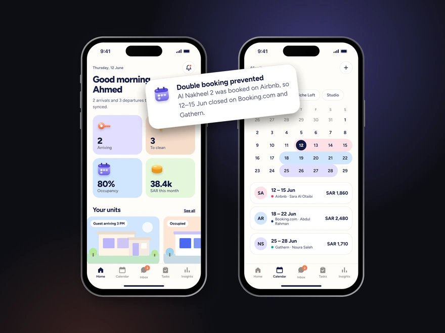
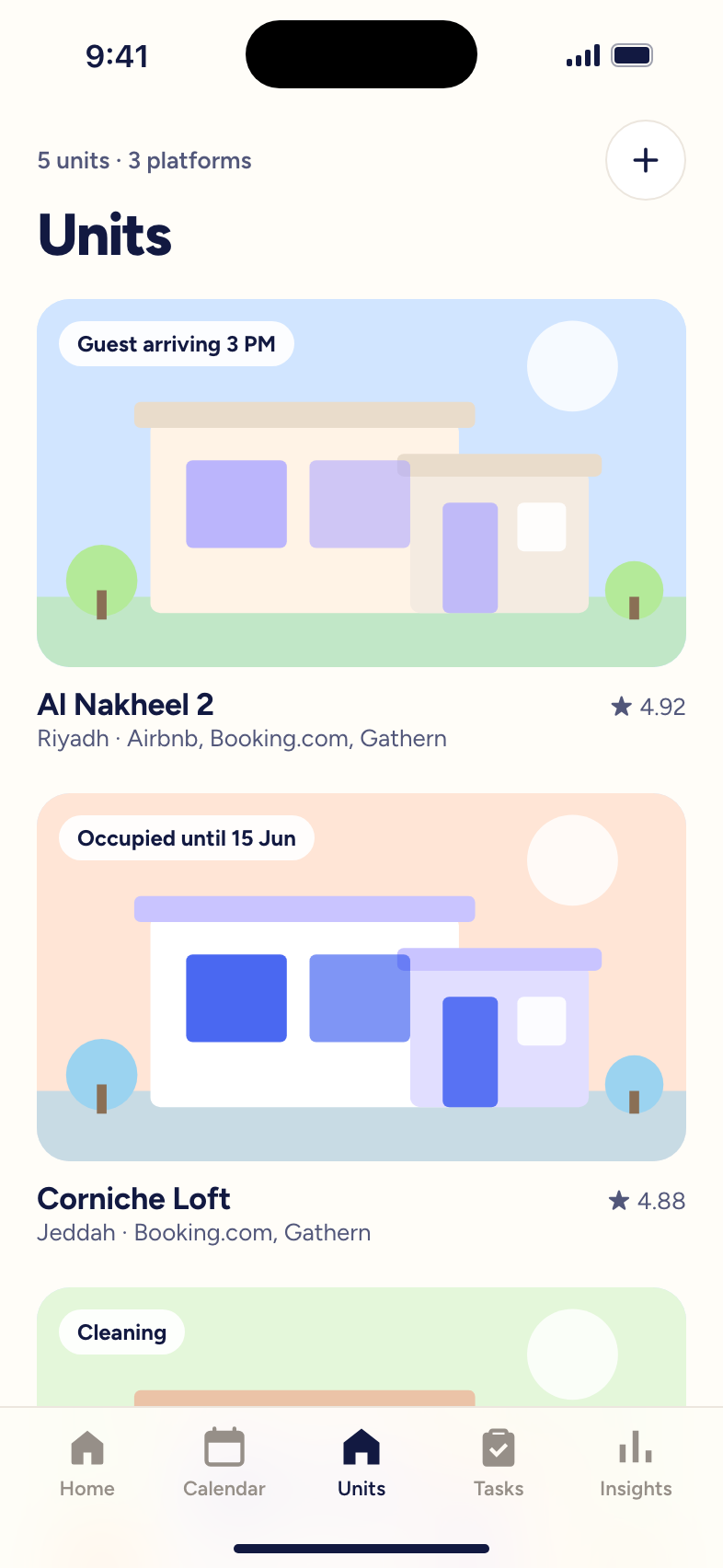
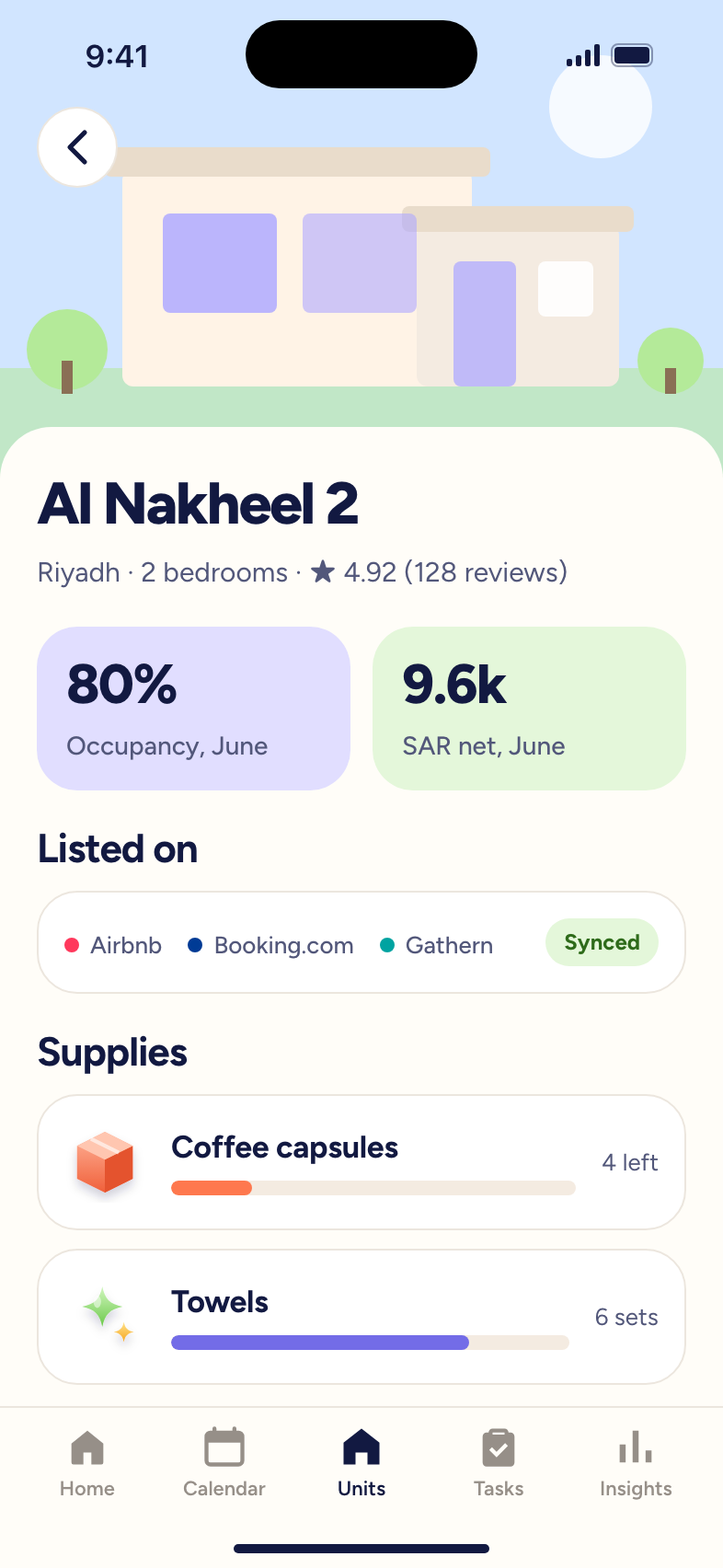
Hosts in Saudi Arabia juggle bookings, guest messages, cleaning and finances across several platforms by hand. As the solo designer, I interviewed hosts running 2 to 9 units, mapped their journeys, and designed one app that syncs bookings and automates the routine work.

A platform that brings bookings from Booking.com, Airbnb and local apps into one place, so hosts can run several rental units without the manual work.
Own or manage two or more units, often as a side business next to a full-time job.
The same unit is listed on Airbnb, Booking.com and local apps at once.
Come from inside and outside Saudi Arabia, with different languages and payment methods.
One place to sync bookings, message guests, coordinate cleaning and track money.
Section 01
Managing rental units across several platforms is slow, manual and error-prone.
Section 02
03 · Discovery
03 · Discovery
Questions in English and Arabic, grouped into five themes.
03 · Discovery
Following one stay from booking to deposit refund, the host does almost every step by hand.
04 · Define
“Property Management Pro”, 38, in Jeddah: manages five rental units as a side business next to a demanding full-time job.
04 · Define
What hosts told us takes the most time and causes the most mistakes.
04 · Define
Keep every platform's calendar in sync, so a unit is never booked twice?
Send guests the right message at the right time without the host typing it?
Turn checkout, cleaning and restocking into one smooth routine?
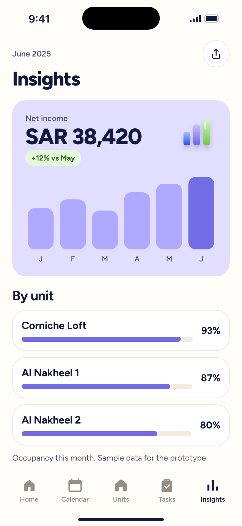
Show a host their income, expenses and unit performance without a spreadsheet?
Section 05

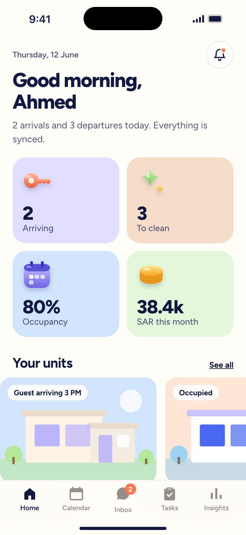
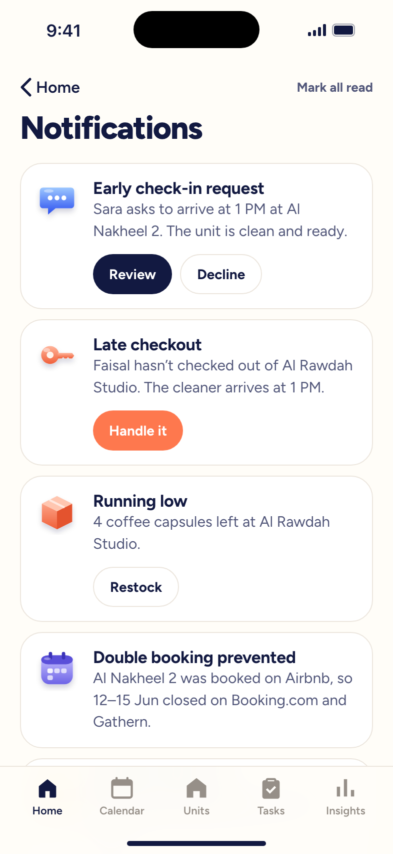
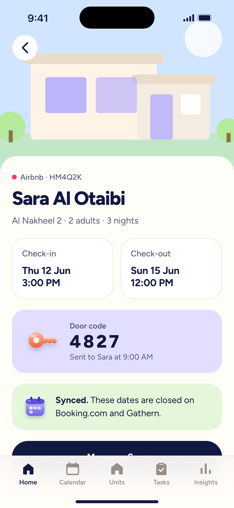
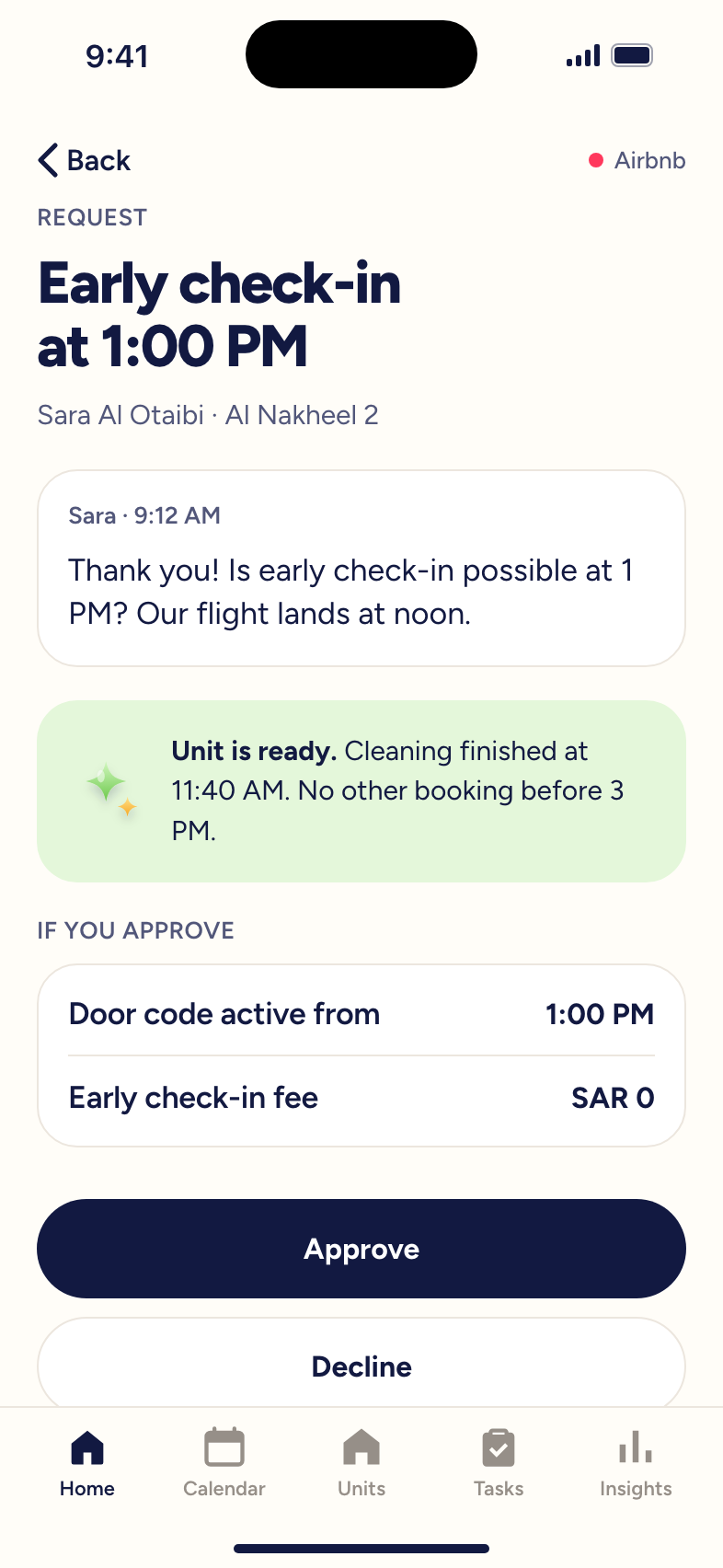
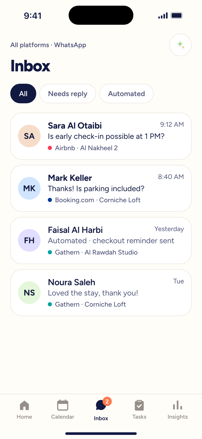
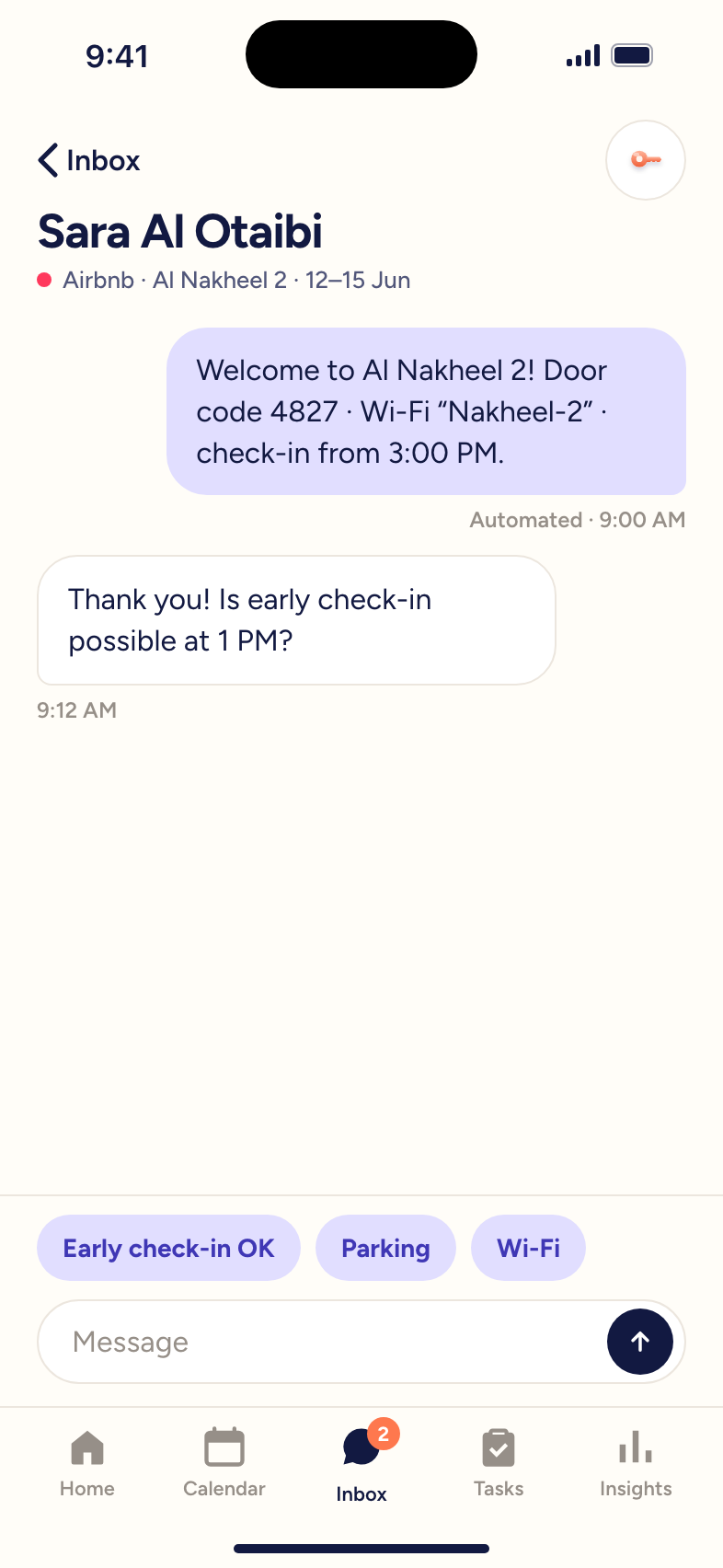
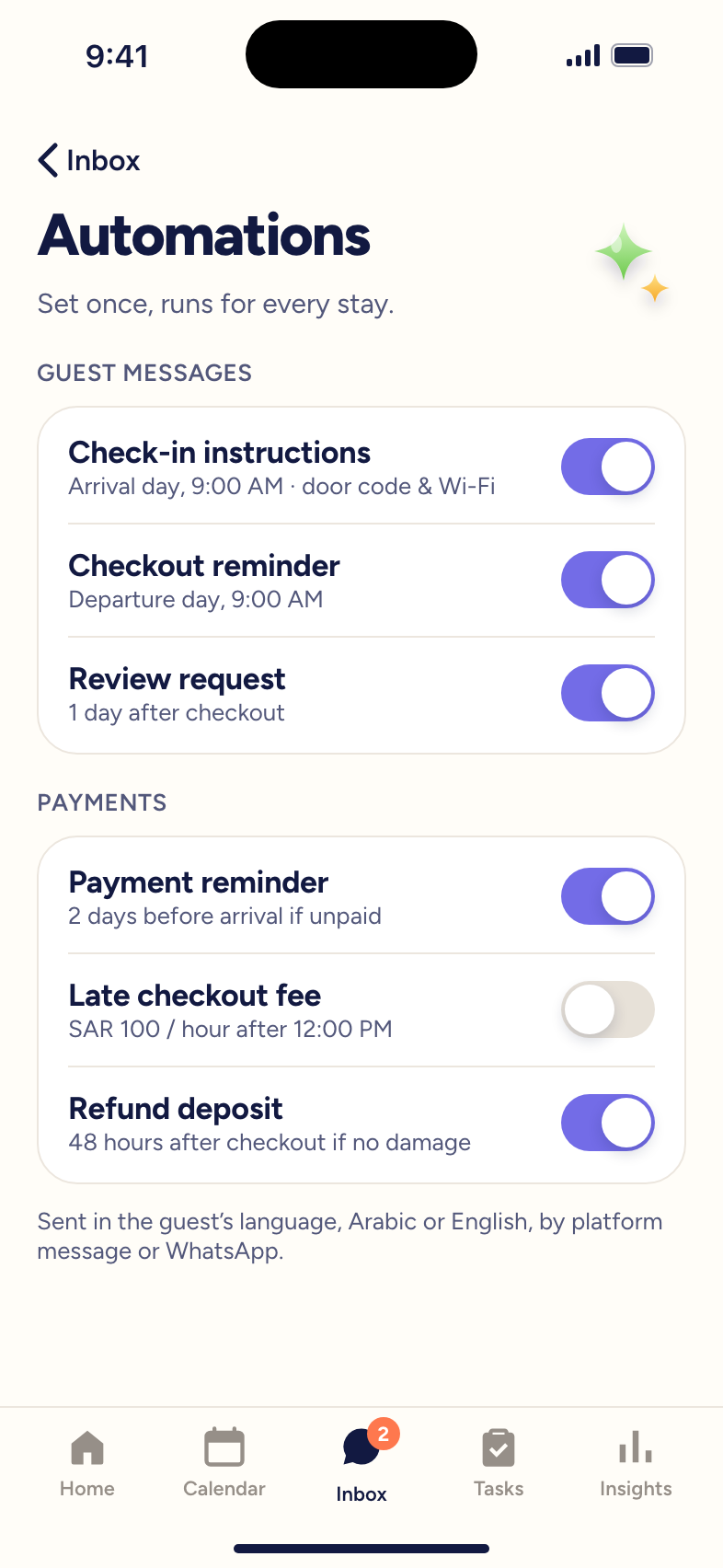
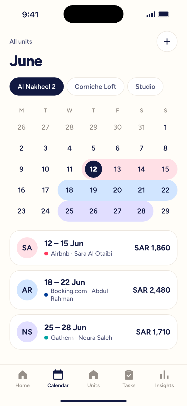
05 · Final solution
The same stay, with the app doing the routine work. Steps marked “Auto” happen without the host.
05 · Final solution
Features in three groups, from connecting the platforms hosts already use to automating the messages they used to type.
05 · Final solution
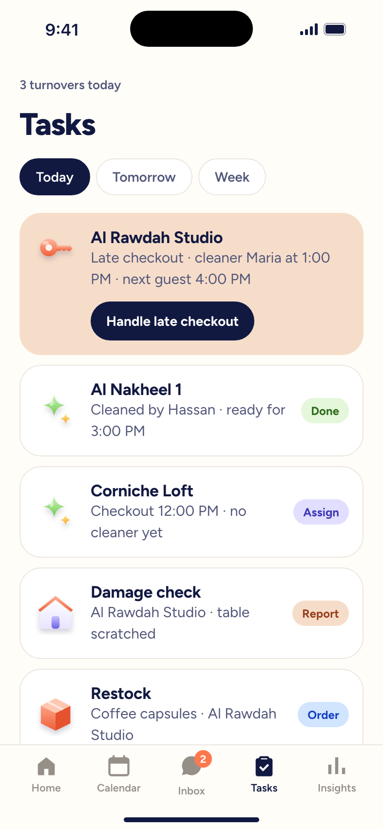
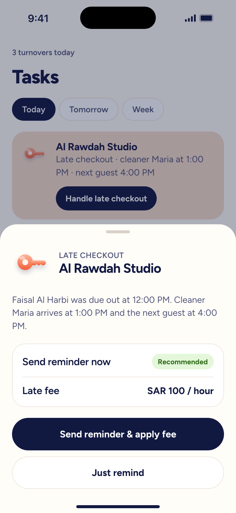
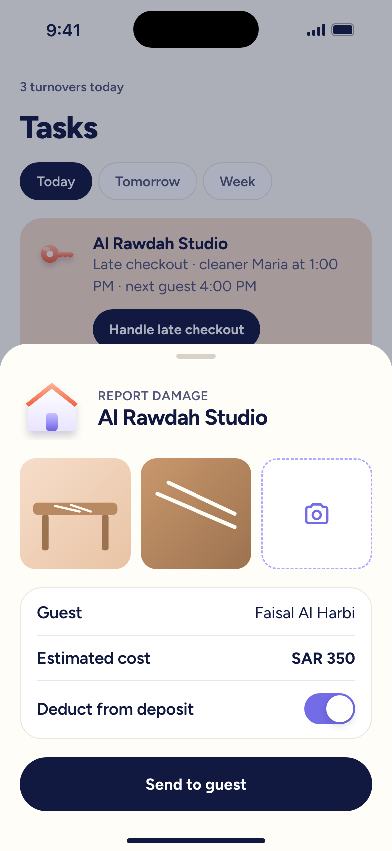
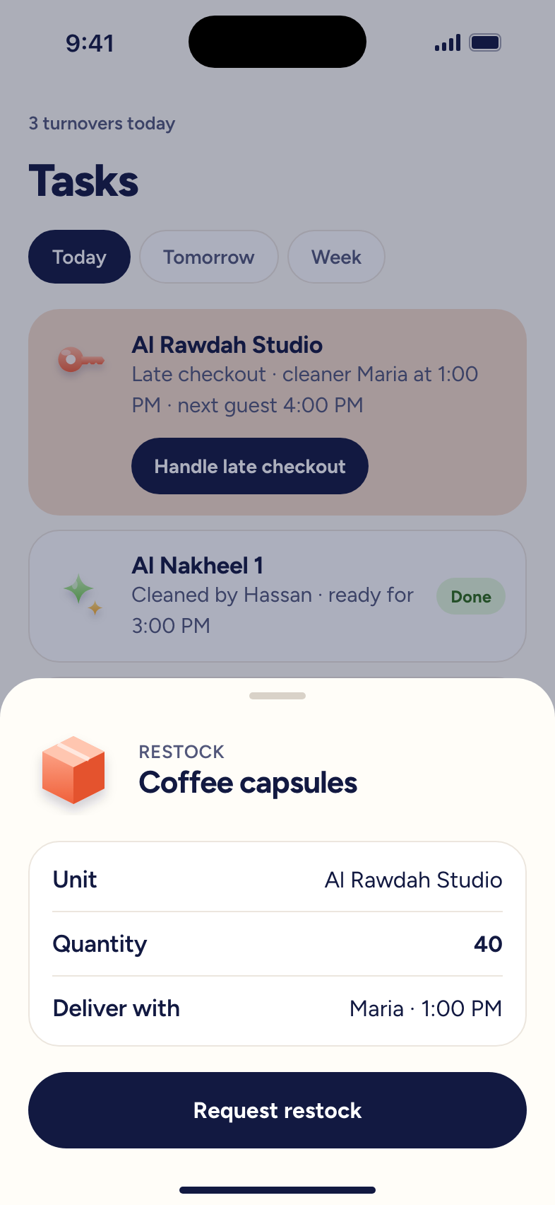
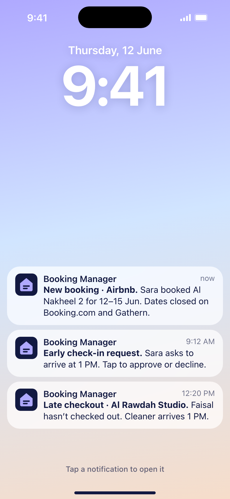
Five tab-bar sections, with everyday actions one tap away and urgent work reachable straight from notifications.
05 · Final solution
05 · Final solution
Start on the lock screen and tap a notification, or explore the tabs: approve a request, handle a late checkout, restock supplies.
05 · Final solution
Section 06
This project covered research and definition. The planned next steps:
Starting with the most valued features
Back to the hosts we interviewed
Compare against today's manual process
Unified Booking Manager
Thank you for taking the time to read this case study.
Case study 03
Enterprise UX · Gas Nomination Platform
Confidential · please don’t share publicly
An Oil & Gas company in Malaysia planned gas supply from 50 suppliers in heavy Excel files, copying every input by hand and re-planning for up to a day after each disruption. I led the design team that joined two months late, found that nobody really knew the users, and turned interviews, journeys and a discovery workshop into an MVP that users rated 4.5 out of 5.

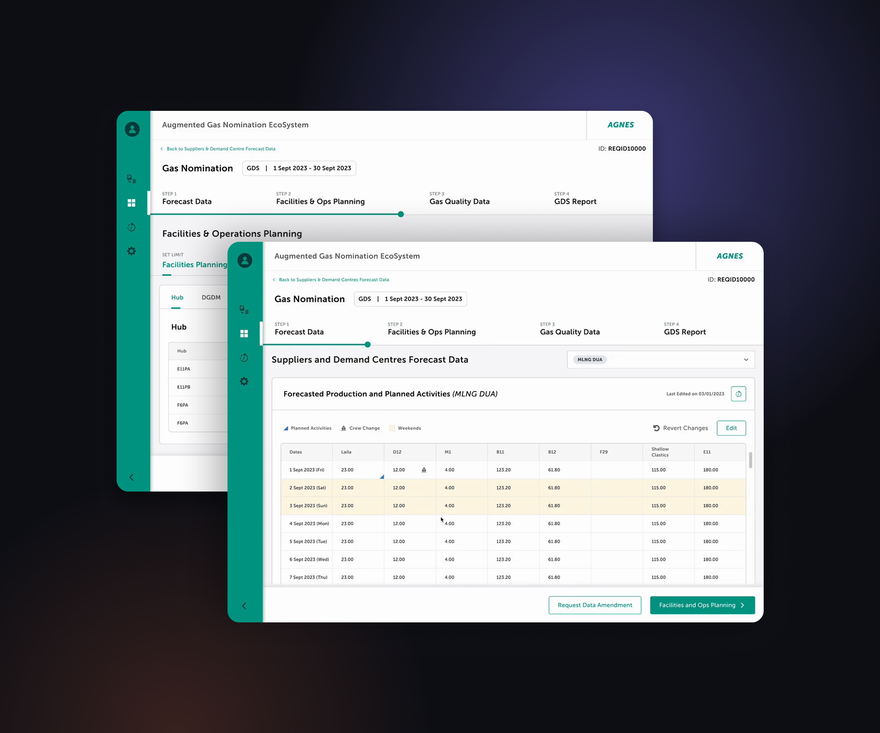
A web platform that helps gas network planners collect forecasts from about 50 suppliers and demand centres, validate them, plan facility activities and run supply simulations, replacing a set of heavy, manual Excel files.
Asks suppliers and demand centres for forecast data and chases missing inputs.
Checks the submitted data, compares it with past forecasts and approves it.
Monitors live operations and advises on activities that affect the plan.
Every plan is prepared for the next 30 days, the next 90 days and the next 1+1 years.
Section 01
The current planning process relies on manual, fragmented Excel workflows, making supplier data time-consuming to process, difficult to track, and inefficient to review at scale.
01 · Problem
Excel sheets full of numbers: hard to read, slow to load and filled in by hand.
01 · Problem
What planners told us in the interviews.
01 · Problem
02 · Challenges
The design team joined the project two months after it started. The business already expected visible designs, so there was no time for full research first.
02 · Challenges
I asked for user interviews. The business suggested talking to the team first, but they knew how the current system worked, not who used it. So I brought 50+ team members together to put every open question on one board.
02 · Challenges
Understand real users when the team building the product doesn't know them?
Get business, users and developers to agree on one version of the requirements?
Get every supplier's data in on time without chasing them one by one?
Let suppliers submit their data once, so planners never retype it?
Spot wrong or changed data without checking every number by hand?
Turn dense Excel sheets into steps a planner can follow during a disruption?
03 · Discovery
The business agreed to user research. To save time, we designed first drafts while the interviews were running, then reviewed them with users.
03 · Discovery
03 · Discovery
Two personas came out of the interviews, each with needs, pain points, observations and opportunities.
03 · Discovery
One planning cycle today, run on Excel, email and WhatsApp: the planner requests, chases, re-types and checks everything by hand.
03 · Discovery
The same cycle with the platform: one request reaches every supplier, inputs flow straight into planning, and the control centre follows along.
03 · Discovery
One map for the whole product, so every later feature had a place to go. Stars mark what shipped in the first release (MVP1).
03 · Discovery
I brought everyone into one room: users, business, project owners, business analysts, developers, solution architects, testers and designers. We reviewed the findings together and agreed on goals, personas, pain points, journeys and the information architecture.
03 · Discovery
Most business requirements didn’t match what users actually need. In the workshop, we replanned the releases around the user research.
To fit the timeline, we kept 15 for MVP1, moved 64 to MVP2 and 11 to the backlog.
04 · Final solution
The 30-day request adds conversion values, a due date and remarks in one form.
Planners request forecast data for a chosen period in a few steps, instead of emailing every supplier.
One click reminds everyone who hasn't submitted, replacing manual follow-ups.
Submitted data lands in one table, with planned activities, crew changes and weekends marked.
Validators confirm the data before the plan moves on, so errors are caught early.
If something looks wrong, planners ask the right supplier to amend just those dates.
04 · Final solution
Planners set facility and operations limits in editable tables instead of separate sheets.
Gas quality for every field in one view, ready for the simulation.
Each request shows its revisions and status, from submission to the final report.
Change one value and re-run the simulation, without rebuilding the whole plan.
Design limits live in settings, so they're set once and reused.
Crew change days per hub, set in a simple weekly grid.
Every change is logged with its before and after value and who made it.
Section 05
At the end of each sprint we tested the designs with real users.
November 2023 · forecast data and facilities planning pages
82% task completion · 4.5 / 5 ease
January 2024 · watching the control centre at work
July 2024 · control-centre modules
80% task completion · 4.5 / 5 ease
05 · Validation
Pages from the planner and control-centre test reports: results, findings and next steps.
Section 06
About 68 hours (99%) saved per planning cycle
Estimates for one cycle with 50 suppliers
| Task | Before | After | Saved |
|---|---|---|---|
| Request data | 8 h 20 min10 min × 50 suppliers | 30 seconds | ~8 h 20 min99.9% less |
| Follow-ups | 4 hours | 30 seconds | ~4 hours99.8% less |
| Data entry | 50 hours1 hour × 50 suppliers | 0 minutes | 50 hours100% less |
| Validation | 6 hours | Automaticdifferences highlighted | ~6 hoursup to 100% less |
| Re-planning after a disruption | 12–24 hours | Under 5 hourstarget | — |
Usability results
Both user groups completed most tasks and rated the platform easy to use
Before any of this was built, the discovery workshop had already caught 33 wrong and 67 missing requirements.
| Users tested | Task completion | Ease of use |
|---|---|---|
| Planners | 82% | 4.5 / 5 |
| Control centre | 80% | 4.5 / 5 |
Gas Nomination Platform
Thank you for taking the time to read this case study.